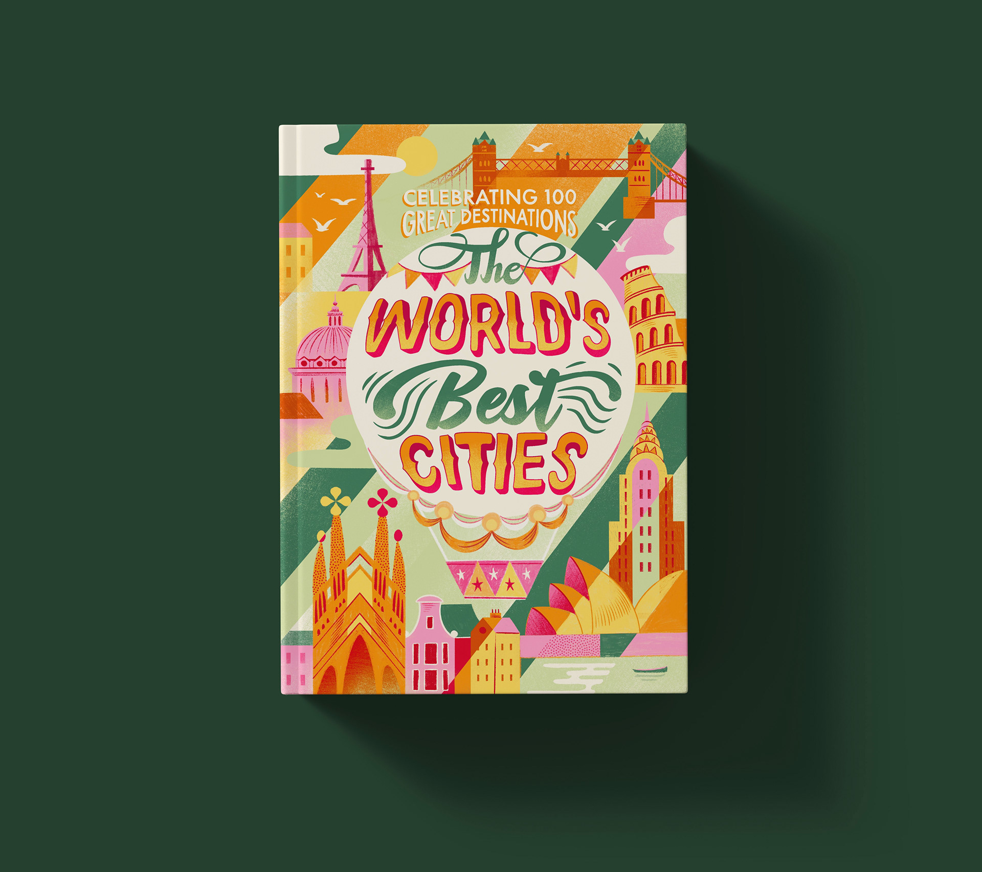
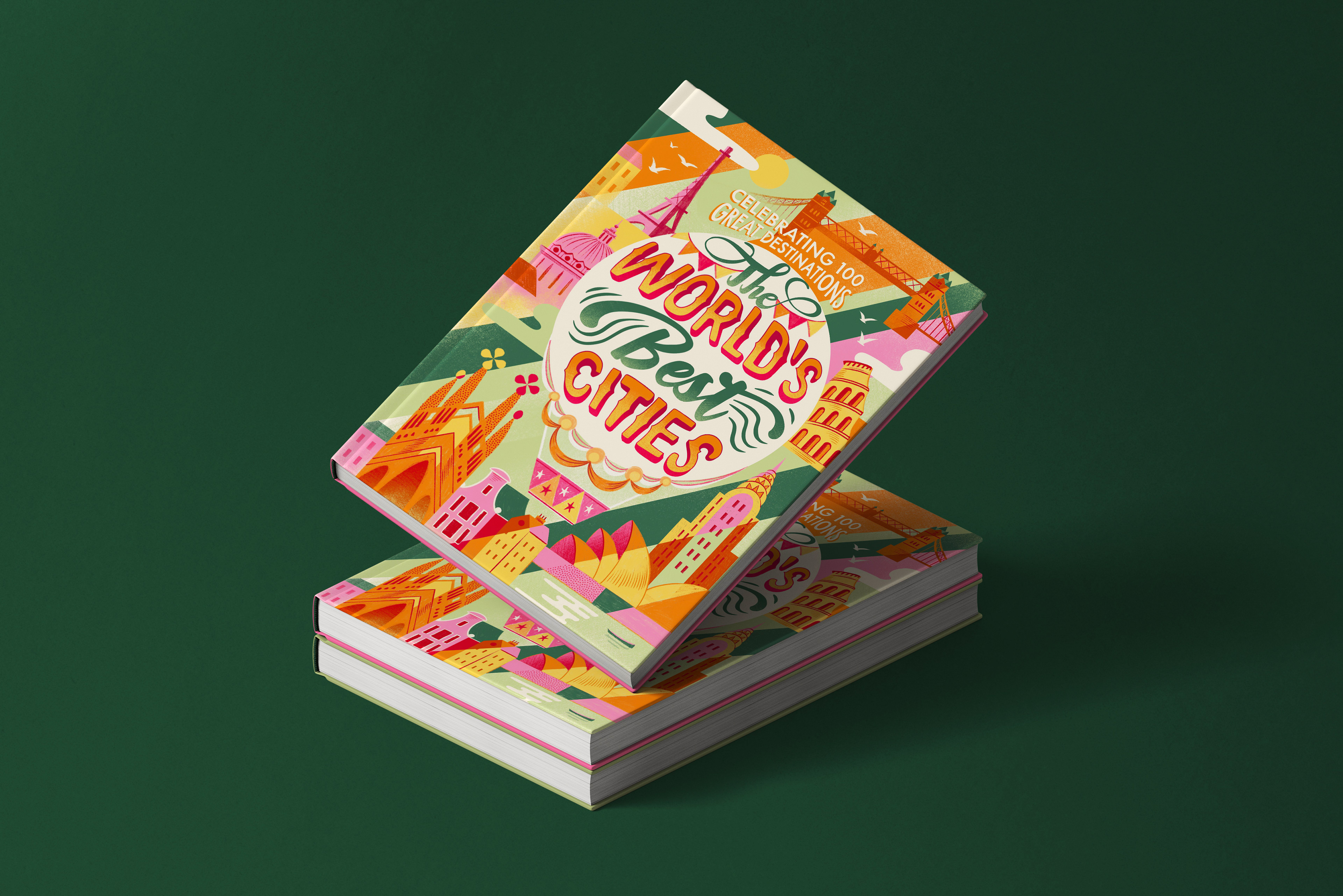
The main goal of this project was to create a cover where the lettering would be the central element of the composition. I wanted the title to feel bold and eye-catching, while still leaving enough space for the illustrated landmarks.
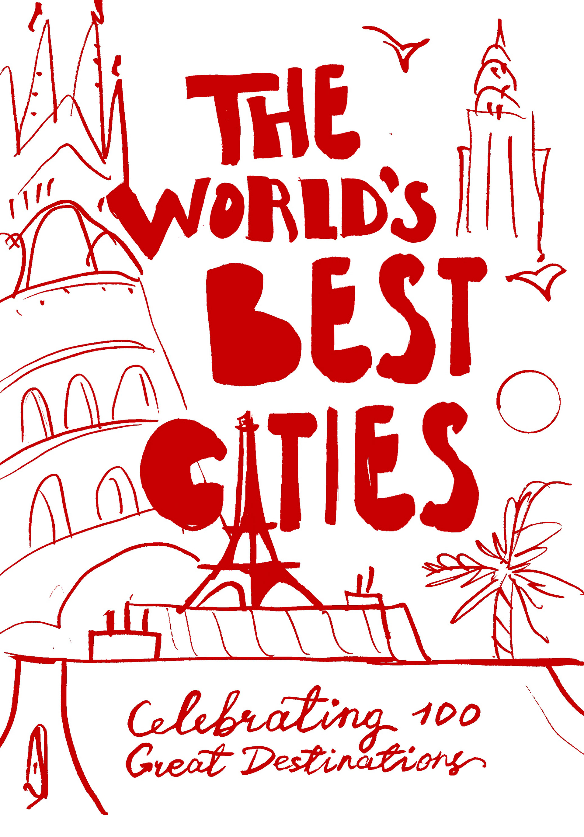
I explored several different compositions and lettering styles during the sketching stage. In the end, I chose the hot-air balloon concept because it was the most striking and suited my slightly whimsical illustration style.
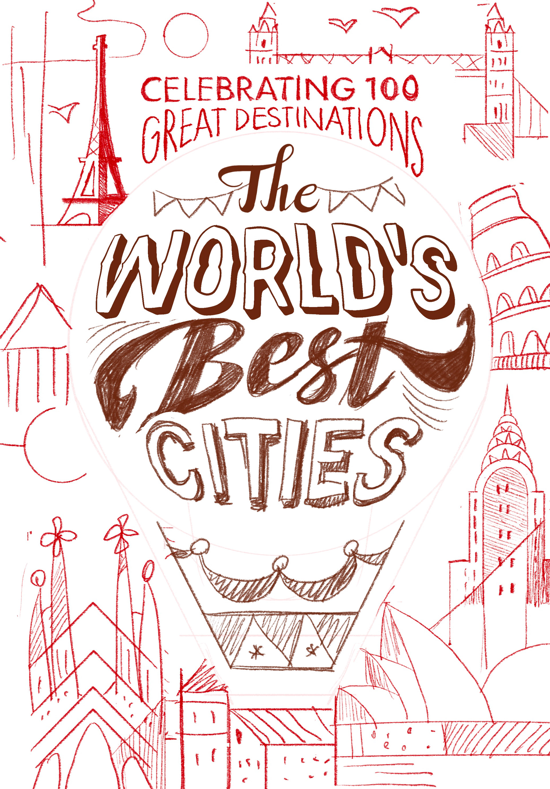
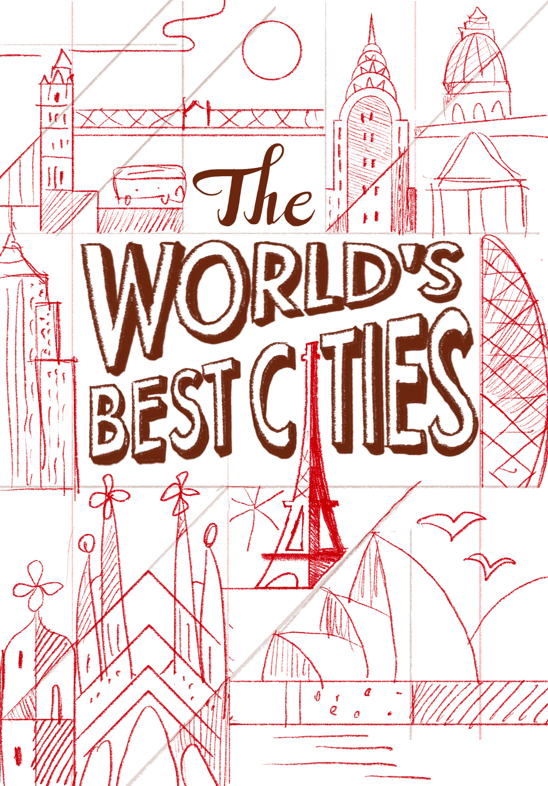
The circular shape of the balloon also gave me an interesting challenge: I had to adjust the letterforms so they would fit naturally inside it while remaining clear and easy to read.
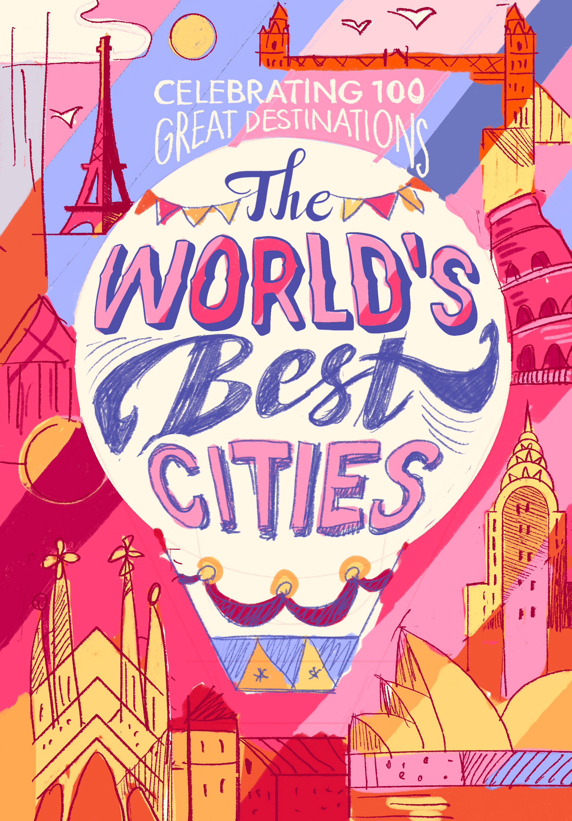
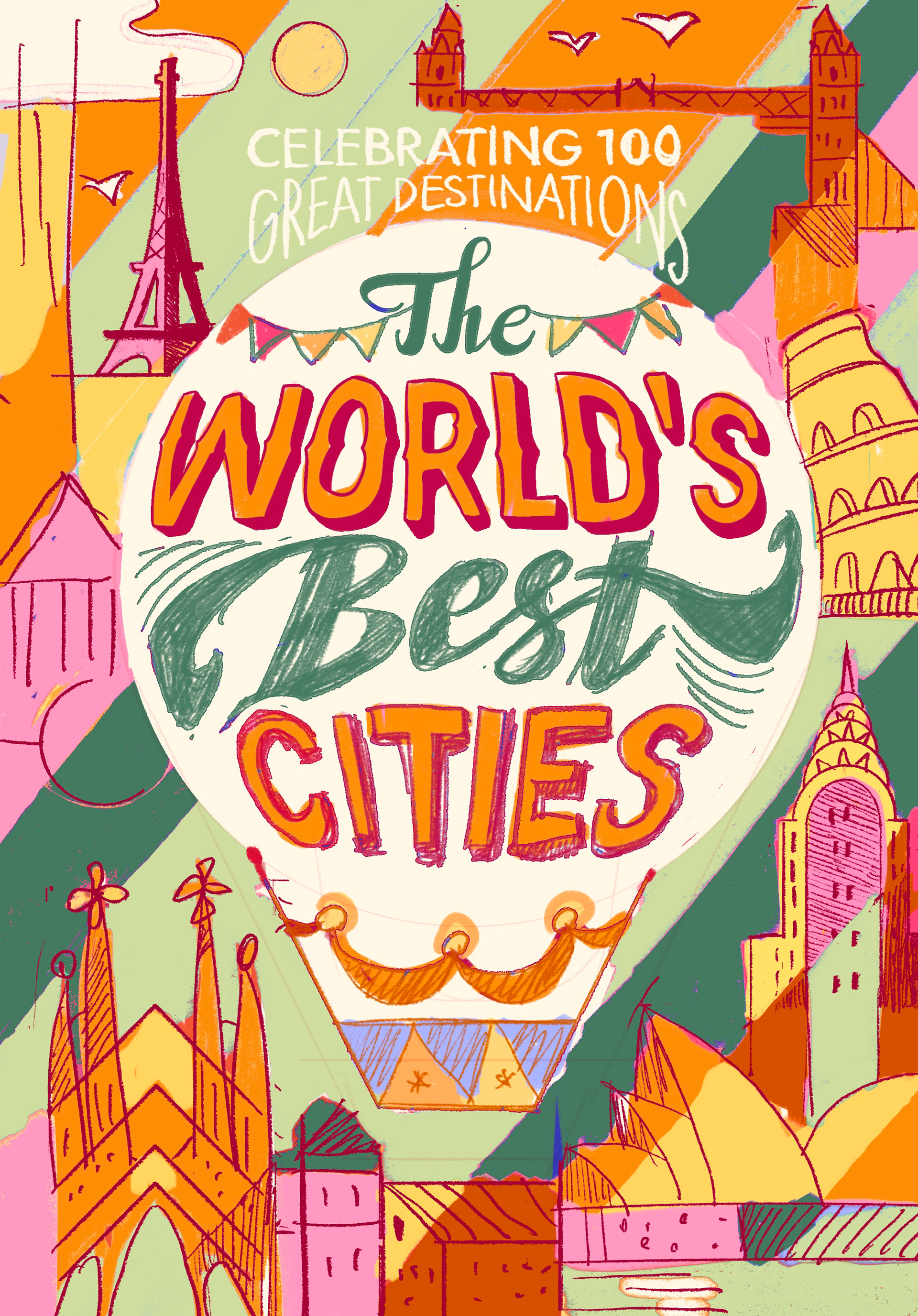
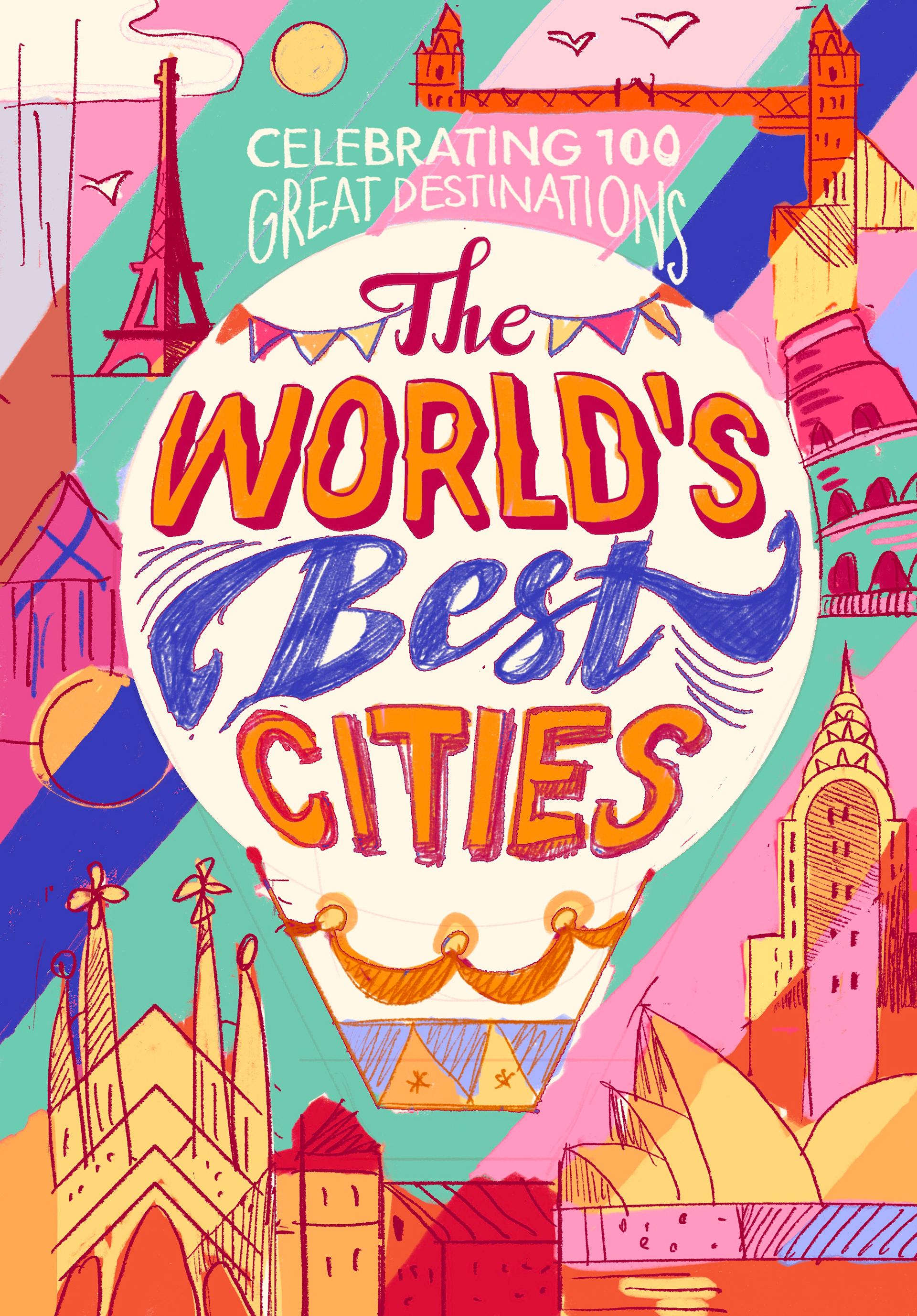
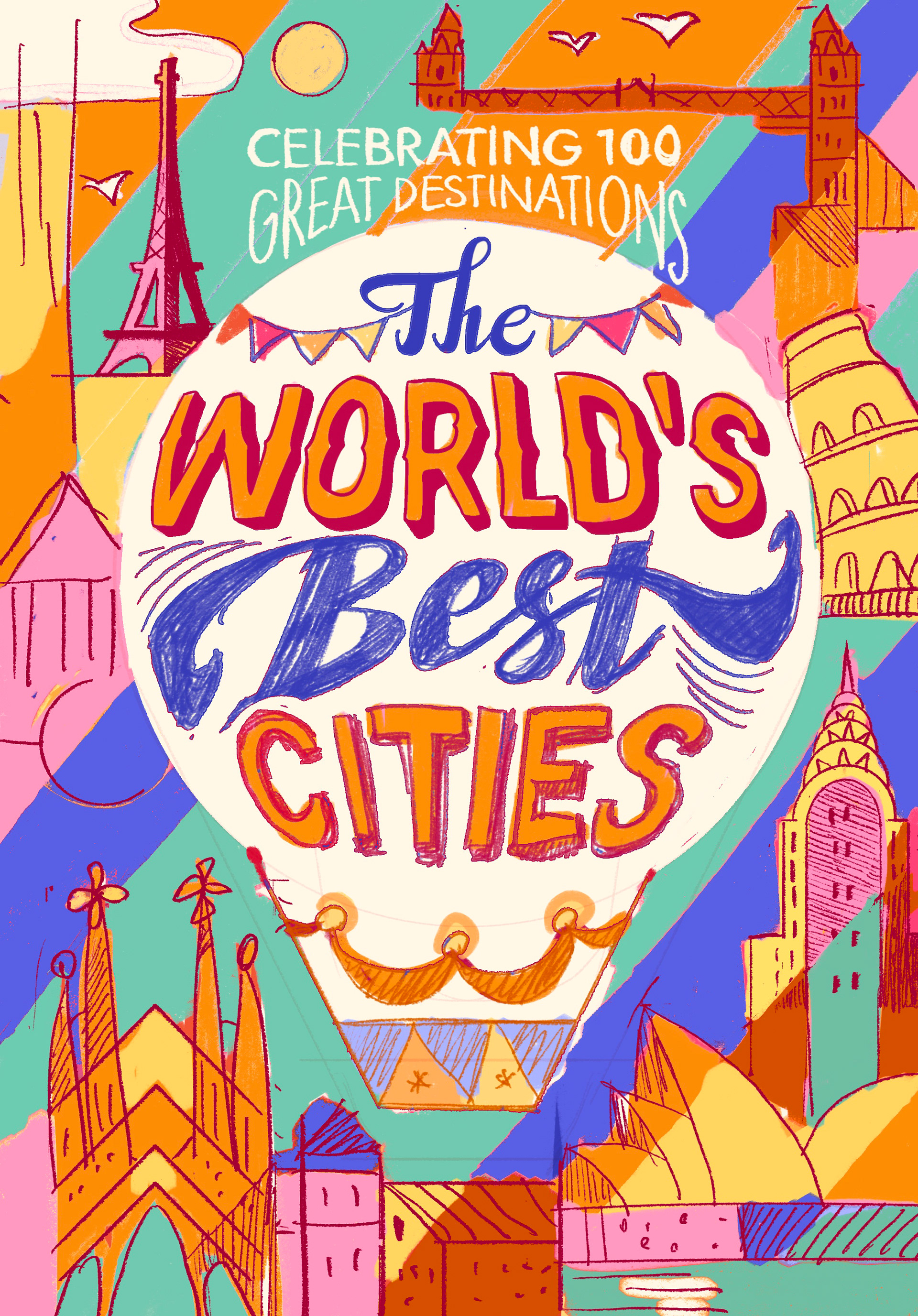
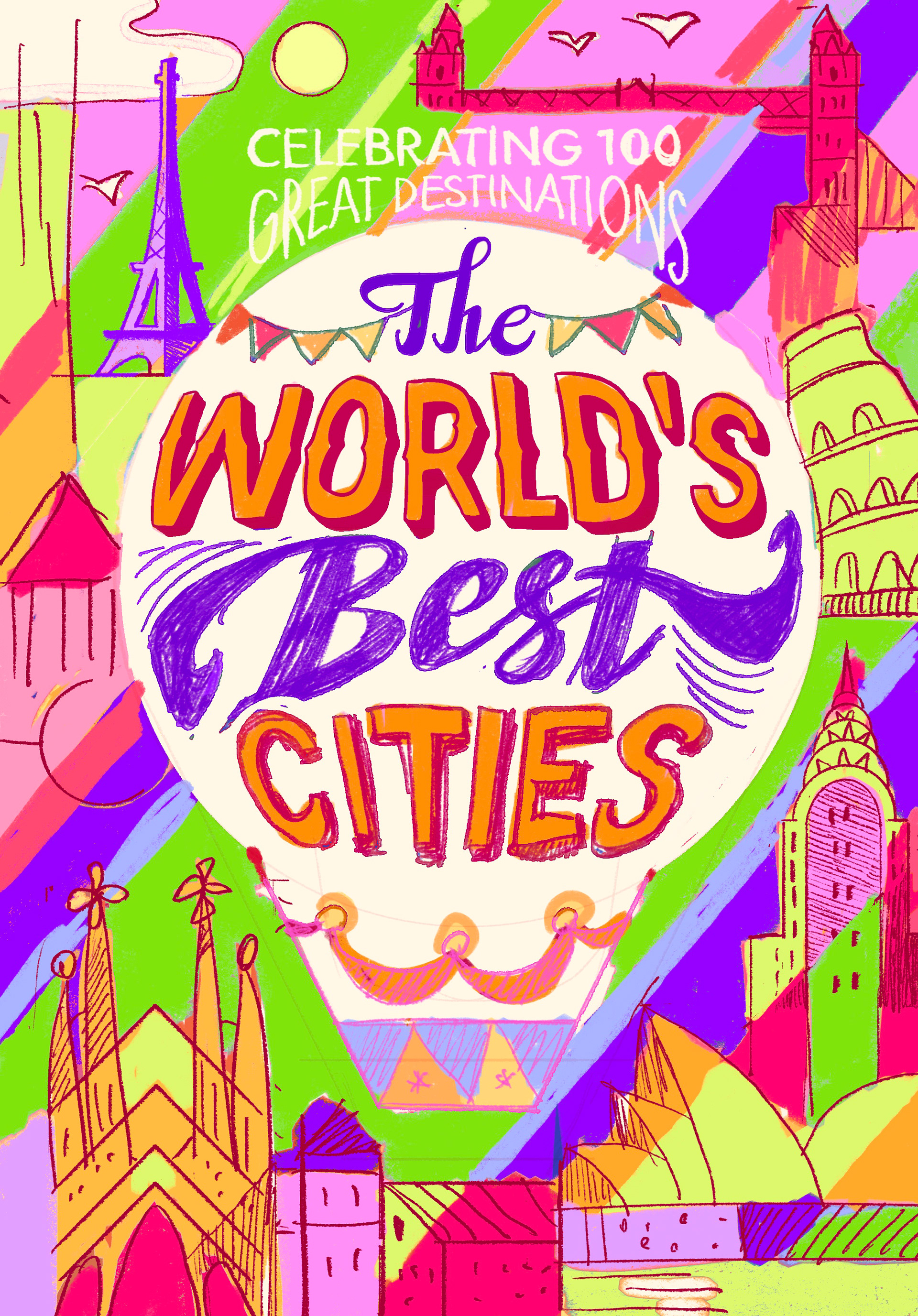
After choosing the composition, I tested several colour palettes. I decided to use green as the main colour because it works beautifully with pink and creates the right balance: bright enough to attract attention, but still calm and harmonious. The colours also give the illustration a subtle retro feeling.
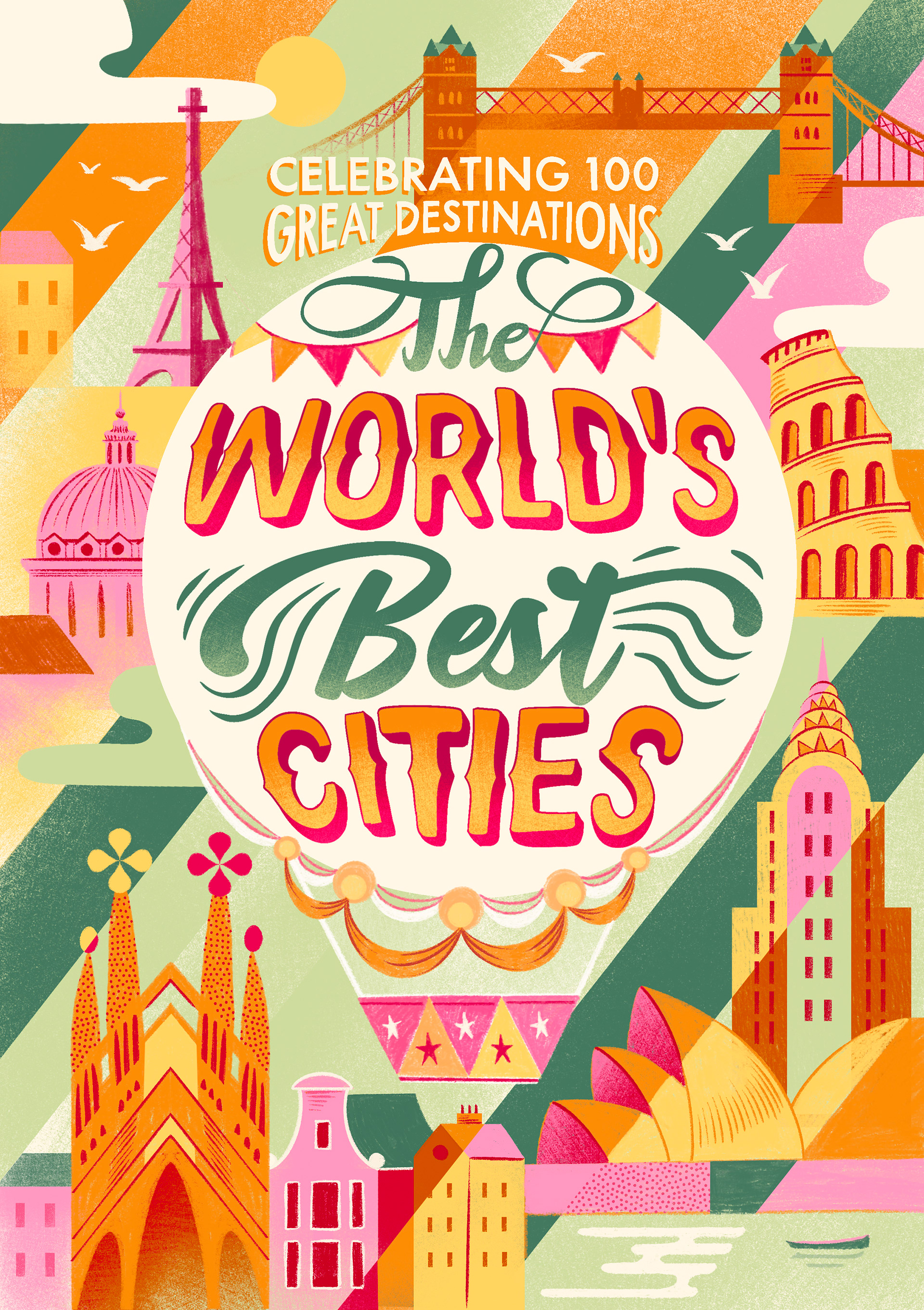
The graphic diagonal shapes contrast with the more organic forms of the landmarks, helping to create movement and balance within the composition. Finally, I added a soft pencil texture throughout the illustration. It brings the different elements together and gives the final cover a warmer, more tactile finish.

For inquiries, please contact me