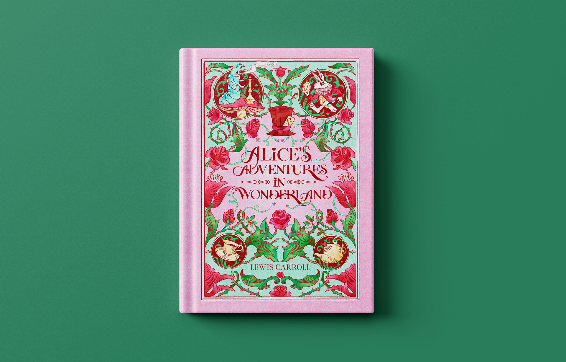
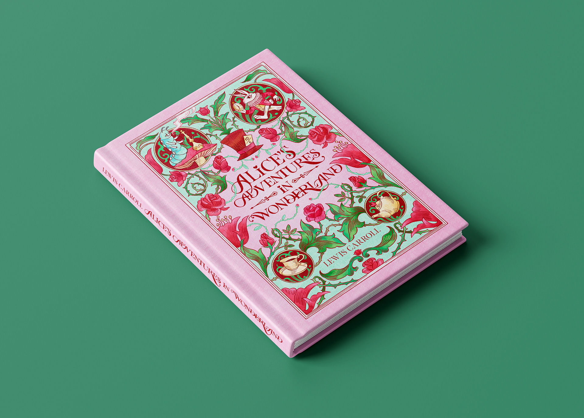
For this cover, I wanted the lettering to be the main focus, but I also wanted the design to feel decorative, whimsical and full of small details. My idea was to make the lettering and the ornamental elements feel like one complete composition, rather than two separate parts.
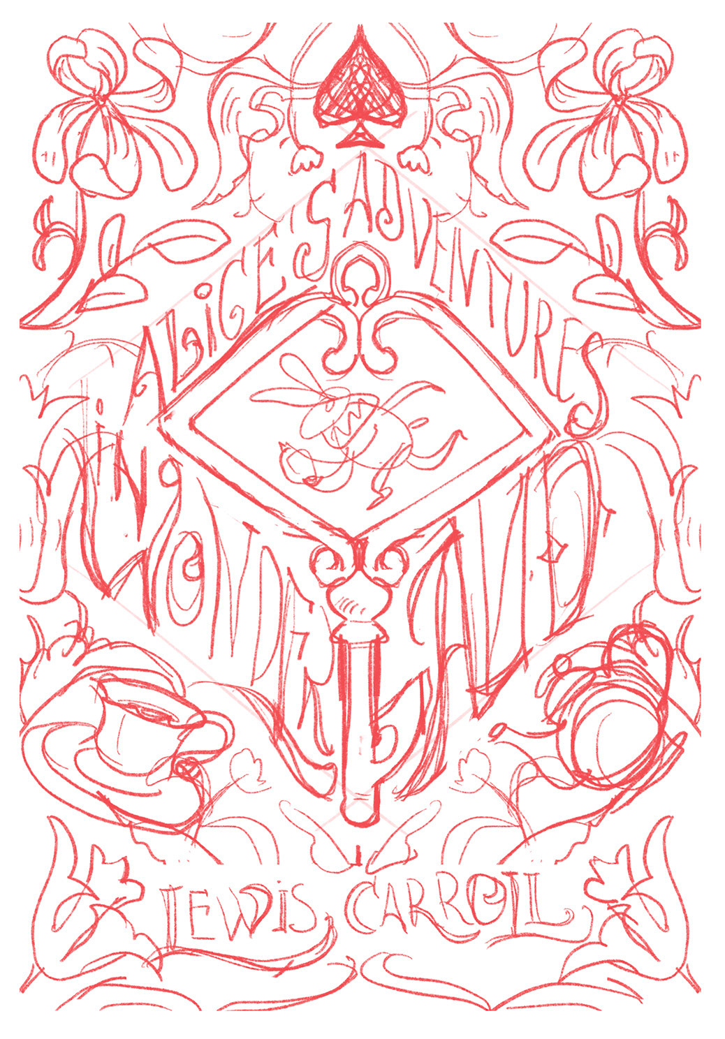
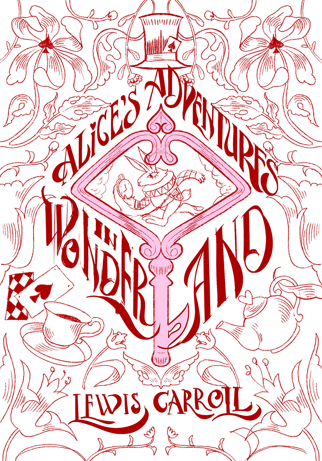
My first sketch was much bolder. I turned the letter L in the word LAND into a key and arranged the other letters around it.
Through the key, we could see the White Rabbit.
I really liked the idea, but when I started refining the sketch, I realized that the lettering was not working as well as I had hoped. Some letters had too much space, while others were placed too close together, and the title became difficult to read.
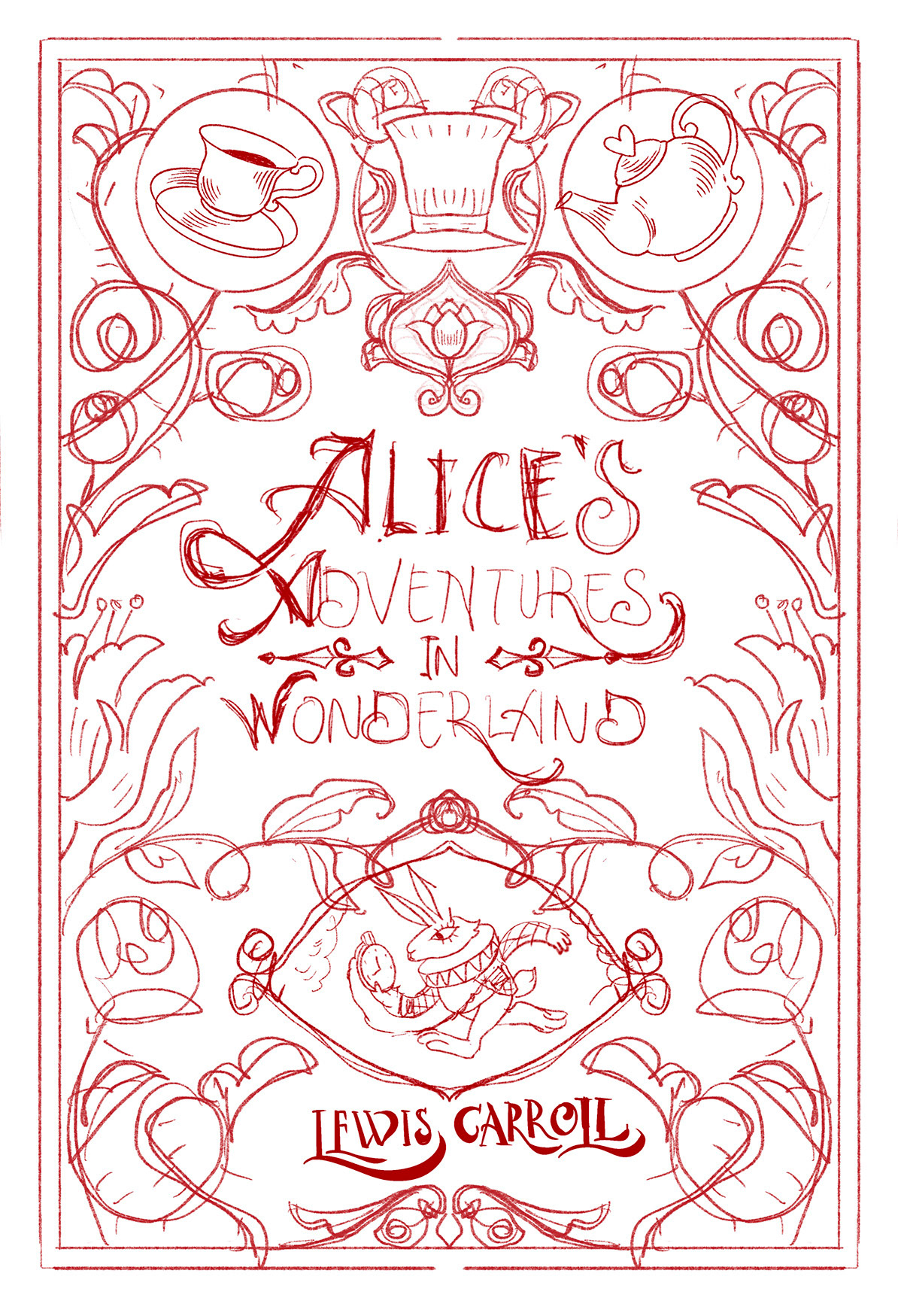
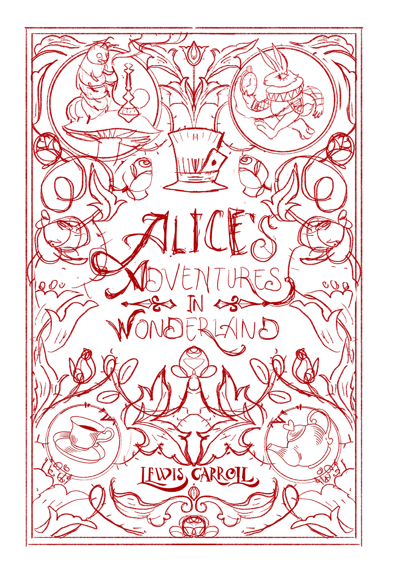
I did not want to sacrifice readability for the sake of the concept, so I decided to completely redesign the composition. The new version gave the lettering more space and allowed it to stay at the centre of the cover.
I knew that I wanted to use pink because I strongly associate this colour with Alice in Wonderland. I tried several colour combinations and found that dark lettering on a light background was much easier to read.
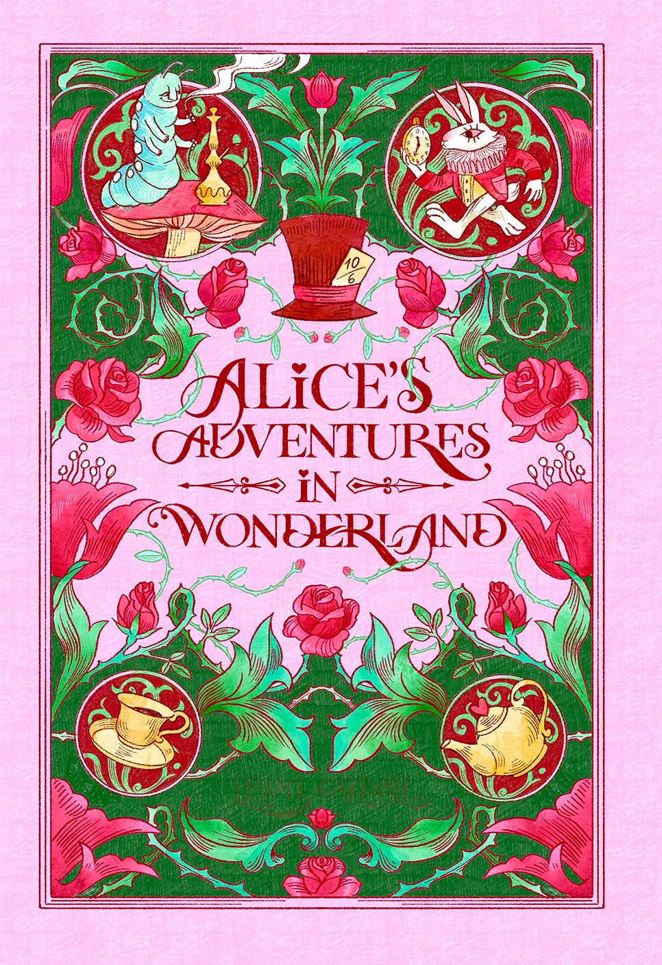
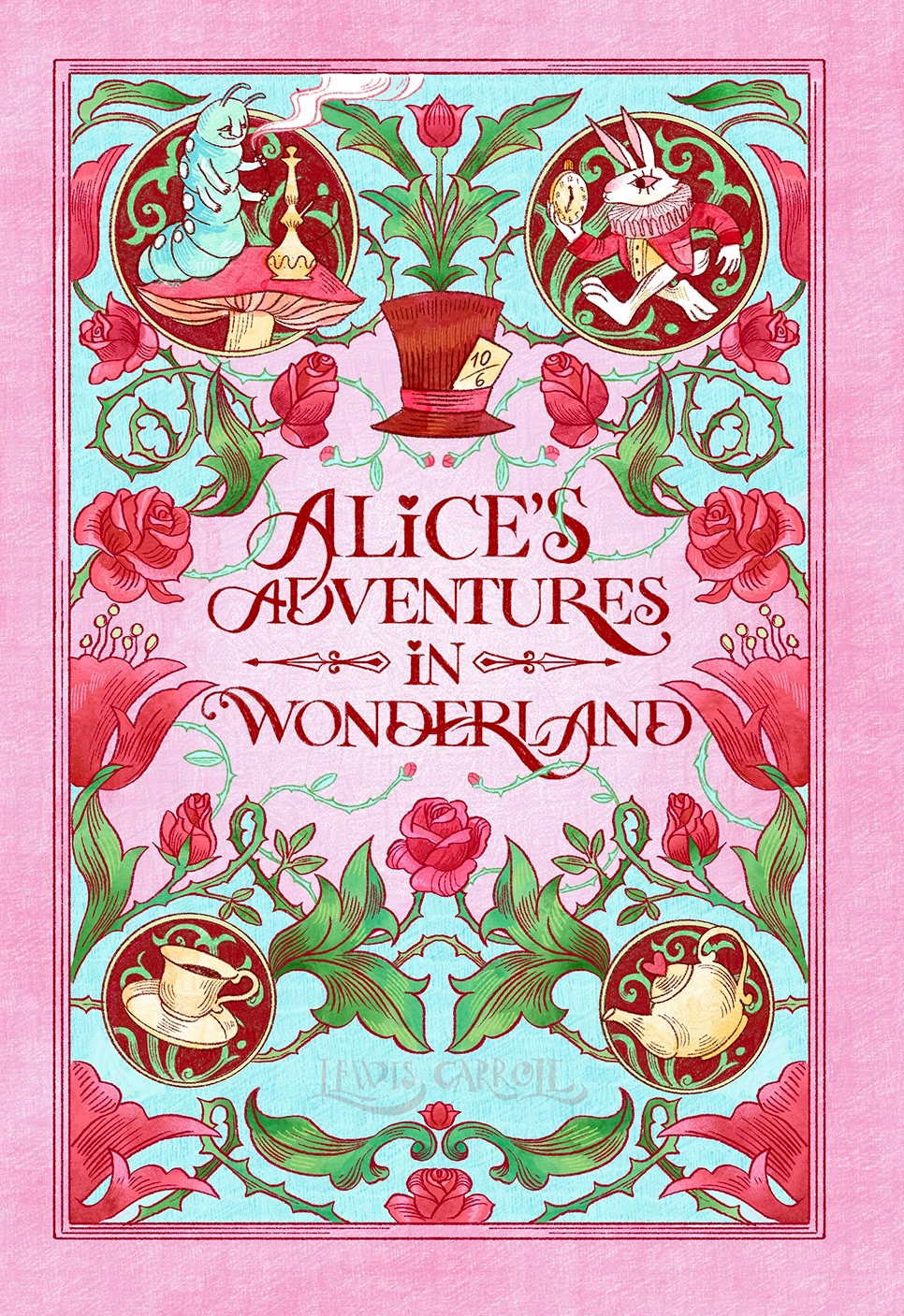
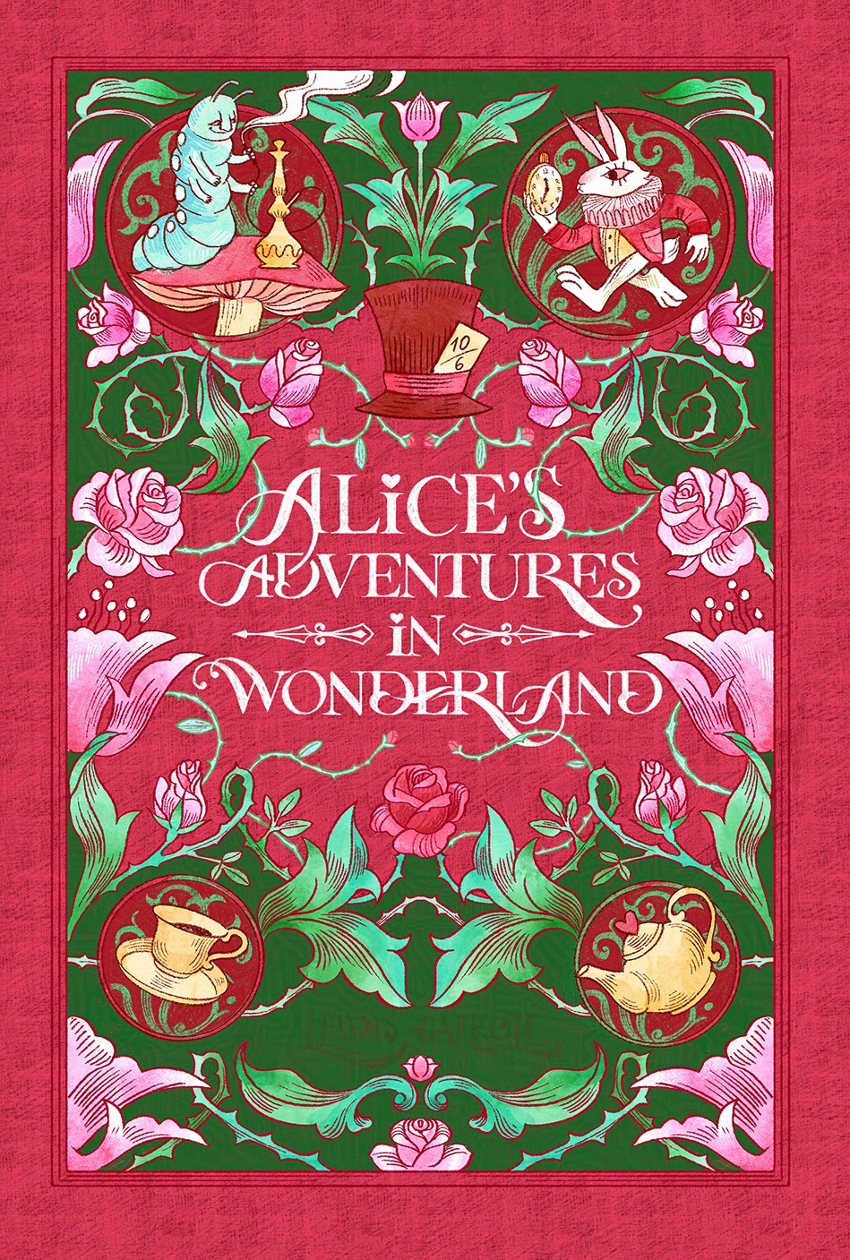
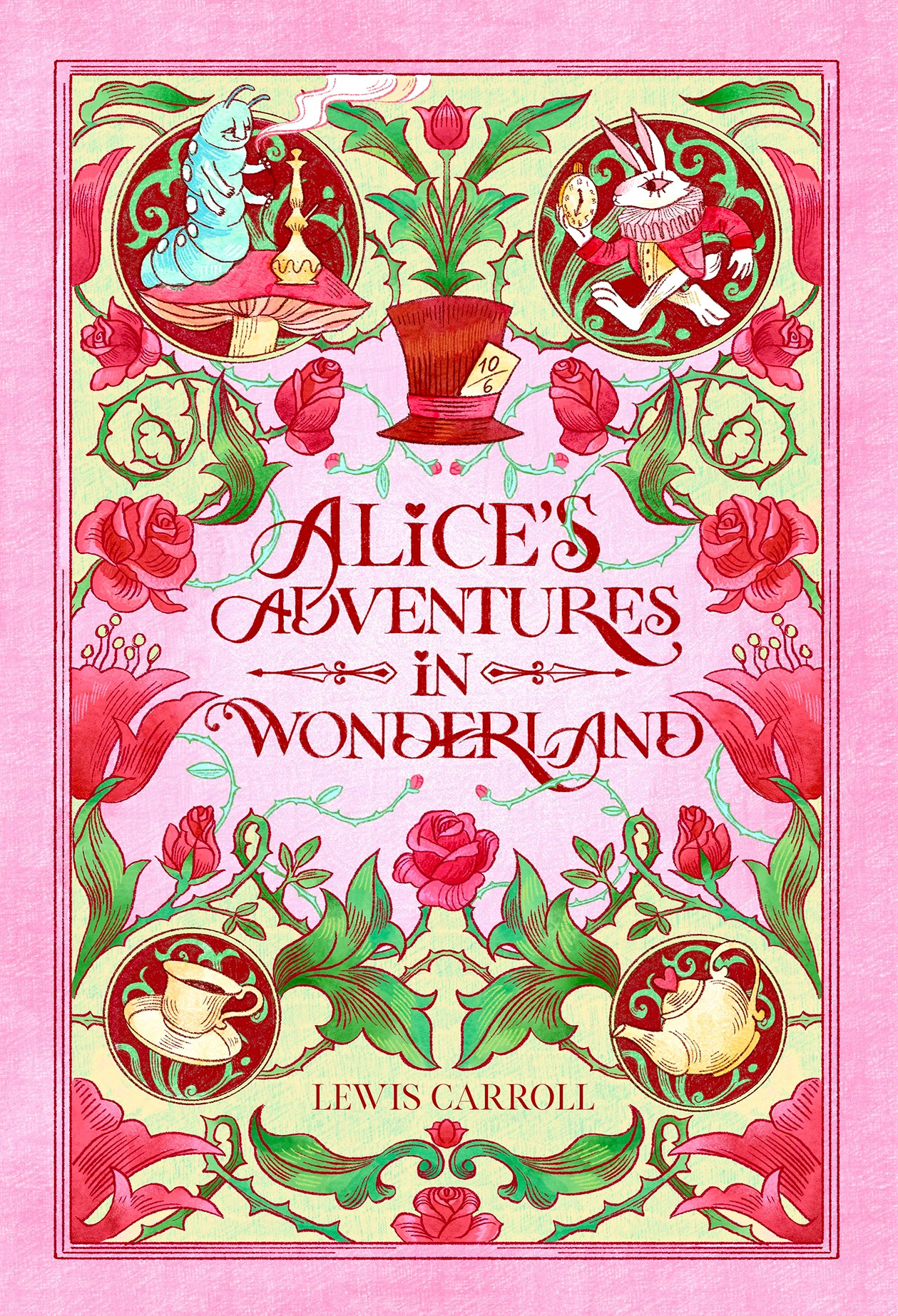
My favourite options were pink with light green and pink with turquoise.
I spent a long time choosing between them, but eventually went with the cooler turquoise palette. To me, it feels slightly strange and magical, which suits the story well.
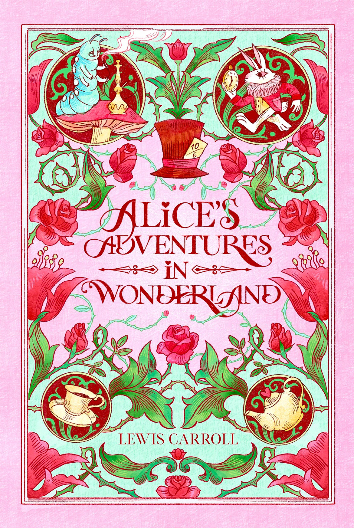
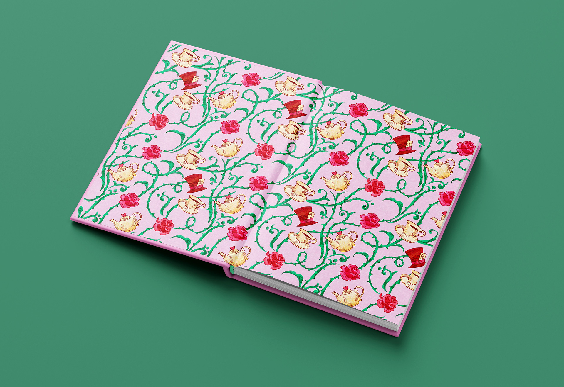
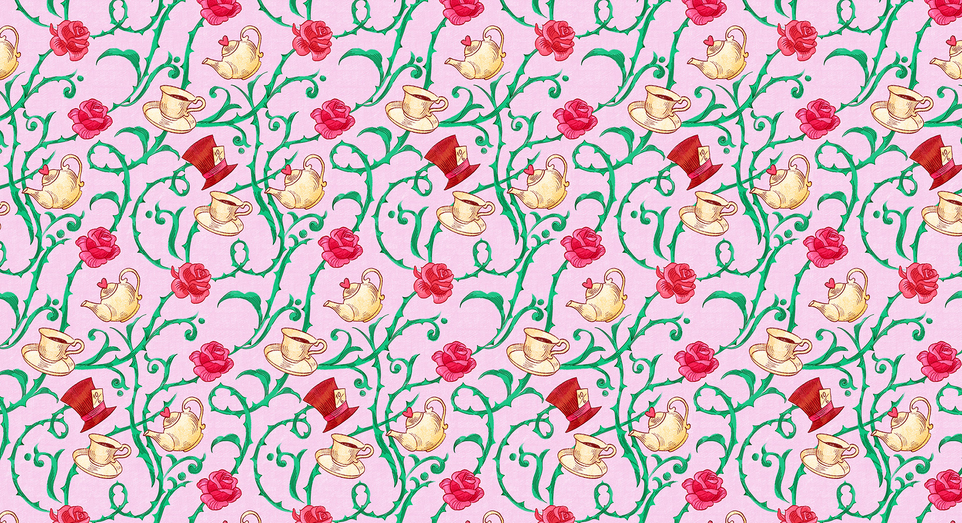
I also created a matching endpaper pattern using the same motifs as the cover, so the whole book design feels connected.

For inquiries, please contact me